Choosing Dining Room Colors For Your Virginia Home
Picking the right color for your dining room is about so much more than what’s on the walls—it sets the stage for family dinners, holiday feasts, and quiet morning coffees. It's less about chasing fleeting trends and more about crafting a feeling of genuine welcome. In 2026, we’re seeing a wonderful move away from cold, stark palettes and toward colors that feel like a warm hug, making this space the true heart of your home.
Crafting a Welcoming Atmosphere with Color
Since we first opened our doors in 1902, we've had the privilege of helping our neighbors across Galax, Hillsville, and Independence create homes filled with warmth and connection. We know that picking a dining room color can feel like a huge, overwhelming decision, but it's really an exciting chance to define the mood for countless memories to come. It’s about more than just paint; it’s about creating an inviting backdrop for your family's best moments.
The right color can make holiday gatherings feel more festive and weeknight dinners more intimate. It’s the thread that ties your furniture, flooring, and personal style together into one cohesive story.
The Big Shift to Warm and Expressive Hues
We're finally moving past the era of cool, minimalist design and embracing colors with real personality and depth. Recent analysis shows a 37% surge in searches for expressive, personalized palettes as dining rooms regain their status as hubs for family life. Paint giants are taking note, with shades like Sherwin-Williams' Universal Khaki and Glidden's Warm Mahogany leading the charge.
These trends are perfect for families in Southwestern Virginia and Northern North Carolina who want to pair a durable dining set from a trusted name like Ashley with a cozy, inviting wall color. You can find more insights on 2026's warmth-driven color trends on accio.com.
"Your dining room is a space for connection. The colors you choose should make people want to pull up a chair, share a story, and stay a while. It's about creating a feeling, not just a look." – Debra Williams, Expert Designer, Guynn Furniture & Mattress
Coordinating with Your Home's Foundation
Before you fall in love with a paint swatch, take a look down. Your wall color has to work in harmony with your home’s existing finishes, and your flooring plays a huge role in the room’s final feel. For example, understanding the nuances of choosing a walnut floor color for your Richmond home can completely change which wall colors will look best.
At Guynn Furniture, we don’t just sell furniture; we help you bring a complete vision to life. Our Design Services can help you coordinate everything from paint to furniture to flooring, and our guide to picking the perfect paint color for your home has even more foundational advice.
Whether you're drawn to a beautiful Bassett dining set or a comfortable La-Z-Boy collection, we have a large in-stock selection ready for immediate, free in-home delivery and setup within 60 miles.
Understanding The Basics Of Dining Room Color
Choosing a color for your dining room can feel like a high-stakes decision, but it doesn't have to be. Think of it less like a test you can fail and more like setting the stage for future memories. The right color palette is all about creating a specific mood and making your family and friends feel welcome.
We’ve been helping our neighbors in Galax, Hillsville, and Independence do exactly that since 1902. The secret isn’t some complex design formula; it’s just a few straightforward concepts that give you a reliable road map.
Warm Versus Cool Colors
First, let's talk about color temperature. Every color carries an emotional weight, generally falling into one of two camps: warm or cool. Each one brings a totally different energy to your dining room.
Warm Colors: Think of reds, oranges, and yellows. These are the colors of a sunset or a cozy fireplace. They are known to stimulate conversation and even appetite, making them a fantastic choice for a lively dining space where you want guests to linger.
Cool Colors: This is the family of blues, greens, and purples. They bring to mind calm waters and quiet forests. Cool colors create a serene, relaxing atmosphere—perfect if you're aiming for a more formal or tranquil dining experience.
A deep, moody blue like Benjamin Moore's Blue Note can feel incredibly sophisticated, while a gentle green-blue like Sherwin-Williams' Still Water can bring a soothing, natural element indoors. The first step is simply deciding what kind of vibe you want for your gatherings.
The 60-30-10 Rule: A Simple Recipe For Success
So, how do you combine these colors without creating a chaotic mess? The answer is the 60-30-10 rule. This is a time-tested design principle that ensures your color palette feels balanced and intentional. It’s the closest thing to a magic formula you can get.
The 60-30-10 rule gives your eyes a clear path to follow, creating a sense of visual balance that makes a room feel complete and professionally designed.
Here’s the simple breakdown for your dining room:
60% Main Color: This is your dominant shade. It typically covers the most surface area—think walls—and sets the overall tone for the room.
30% Secondary Color: This color is there to support the main one and add visual interest. You'll often see it in large furniture pieces like a beautiful Bassett dining set or an area rug.
10% Accent Color: This is your final flourish! It's the pop of color used sparingly on smaller items like decor, artwork, or the metal finish on your light fixtures.
For instance, you could paint your walls a rich, inviting navy (60%). Pair that with the warm wood tones of a stunning Ashley dining table and chairs (30%). To finish, introduce brass or gold in your chandelier and decorative accents (10%).
This simple guideline creates a layered, polished look without any of the guesswork. It works whether you're decorating a new home in Southwestern Virginia or just refreshing a room you've loved for years. For more inspiration, our guide to dining room decorating ideas can help you visualize how to bring your color palette to life.
How Light And Room Size Influence Color Choices
Have you ever picked the perfect paint swatch at the store, only to watch it turn into a completely different color on your dining room wall? If you’ve been surprised by how a color shifts from morning to night, you’ve seen the power of light firsthand. This isn’t about complex science; it’s about learning to work with what you have to make your chosen colors truly shine.
As your helpful neighbors serving Galax, Independence, and the wider Southwestern Virginia region, we've seen how the same paint can look dramatically different from one home to the next. It all comes down to the quality of sunlight your room gets, which is dictated by the direction your windows face.
Working with Natural Light
A room’s orientation is your first and best clue for picking the right color family. Think of it like this:
- North-Facing Rooms: These spaces get cool, indirect light all day long. To keep them from feeling chilly, you’ll want to lean into warm dining room colors. Think creamy whites, soft tans, or rich earthy tones that bring a sense of coziness to balance the coolness.
- South-Facing Rooms: These are your sun-drenched spots, blessed with bright, warm light for most of the day. They can handle bolder, cooler colors—like a deep navy or a sophisticated gray—without ever feeling stark. The intense light will keep these shades feeling vibrant, not gloomy.
- East-Facing Rooms: You get that beautiful, bright light in the morning that softens and cools as the day wears on. A versatile color with some depth, like a soft green or a warm gray (greige), will look fantastic in both the morning and afternoon light.
- West-Facing Rooms: These rooms are often cooler in the morning but are bathed in a gorgeous, warm glow in the evening. This is the perfect chance to use colors that come alive in the golden light of a sunset.
Does Size Really Matter for Dining Room Colors?
Many of our customers in Hillsville and the surrounding Northern North Carolina area have heard the old rule: small rooms must be painted white. We’re here to officially bust that myth! While light colors can certainly create an airy feel, they are far from your only option.
A common misconception is that dark colors make a small room feel smaller. In reality, a deep, rich color can blur the corners of a room, creating a 'jewel-box' effect that feels incredibly intimate, cozy, and surprisingly grand.
In a smaller dining room, a bold choice like a navy or charcoal gray can create a dramatic, elegant backdrop for your meals. The secret is to commit to the color and support it with good lighting.
On the other hand, a very large dining room can sometimes feel impersonal or cavernous. Wrapping the walls in a medium-to-dark warm color can help the space feel more connected and welcoming. If you want to dive deeper into this, we’ve got a whole article on how to make a small room feel bigger.
And don't forget about your light bulbs! Beyond natural light, the artificial lighting in your dining room drastically changes how colors look after dark. For some great pointers on light temperature, check out these essential bulb color tips. Getting the bulbs right is just as important as getting the paint right.
Top Dining Room Color Palettes For 2026
Alright, this is the fun part. Choosing the colors for your dining room is about more than just paint—it's about creating the backdrop for future memories. To get you started, we’ve put together a few curated palettes inspired by the 2026 trends we're seeing and the natural beauty right here in Southwestern Virginia and Northern North Carolina.
We’ve broken each one down with the classic 60-30-10 rule to take the guesswork out of it. Whether you’re an Aspiring Remodeler starting from scratch or a Traditionalist just looking for a refresh, these ideas will help you build a space that feels just right for your family.
To make it even easier, here's a quick-reference table summarizing our top three palettes for the year. Each one is designed to be a complete, ready-to-use concept for your dining room.
2026 Dining Room Color Palette Inspiration
| Palette Name | 60% Main Color (Walls) | 30% Secondary Color (Furniture/Large Textiles) | 10% Accent Color (Decor/Art) |
|---|---|---|---|
| Blue Ridge Morning | Soft, Muted Blue-Gray | Warm, Natural Woods (Oak/Cherry) | Creamy Whites & Brushed Silver |
| New River Valley Warmth | Earthy, Nature-Inspired Green | Rich, Dark Woods (Espresso/Walnut) | Warm Brass & Deep Terracotta |
| Patina & Prose | Sophisticated Off-White | Deep, Saturated Blue or Teal | Aged Copper & Matte Black |
These palettes are just a starting point. Feel free to mix and match or adjust the tones to fit the light and feel of your own home. Now, let's dive into the details of each look.
Blue Ridge Morning Palette
Imagine the soft, hazy light of a morning in the Blue Ridge Mountains. This palette is designed to feel calm, airy, and deeply connected to nature. It’s perfect for creating a serene space that encourages quiet conversation and peaceful family meals.
- 60% Main Color (Walls): Start with a soft, muted blue-gray like Sherwin-Williams' Sleepy Blue. This shade has just enough color to feel present but remains gentle and light, creating a tranquil atmosphere that works beautifully from morning coffee to evening dinner.
- 30% Secondary Color (Furniture/Rug): The warm, natural tones of a classic wood dining set are the perfect counterpoint. A timeless Bassett dining table in a medium oak or light cherry finish provides a beautiful, earthy contrast to the cool walls, grounding the space.
- 10% Accent Color (Decor): Finish with creamy whites and brushed silver. Think white linen curtains, a simple white ceramic vase on the table, and brushed silver hardware on a sideboard to complete the clean, refreshing look.
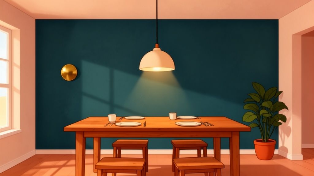
New River Valley Warmth Palette
Inspired by the rich earth tones and golden sunlight along the New River, this palette is all about creating a cozy, inviting, and slightly rustic feel. It’s a wonderful choice for families who want their dining room to feel like a warm hug—a space where everyone wants to linger long after the meal is over.
This infographic shows how the direction your room faces impacts the feel of these warmer and cooler palettes.
As you can see, a north-facing room really benefits from warmer tones to counteract the cool natural light, while a sunny, south-facing room can handle cooler palettes without feeling stark.
Here’s how to bring this warmth home:
- 60% Main Color (Walls): An earthy, nature-inspired green is the anchor. A shade like Benjamin Moore’s Cleveland Green brings the outdoors in, creating a comforting and organic backdrop that feels both sophisticated and down-to-earth.
- 30% Secondary Color (Furniture/Rug): Go for a rich, dark wood finish. Imagine a sturdy Ashley dining set in a deep espresso or walnut finish. This adds a sense of history and durability that we value so much here in the Hillsville and Galax communities.
- 10% Accent Color (Decor): Layer in warm brass and deep terracotta. Accents like a brass chandelier, terracotta pots with greenery, or even rust-colored napkins add that final touch of inviting warmth.
Patina & Prose Palette
This palette blends historic charm with modern sensibilities, perfect for a home that values both our "Since 1902" legacy and today's style. It takes cues from the growing trend of "lived-in" luxury, mixing colors that have a sense of history with clean, contemporary lines.
Historical data shows that earthy tones and nature-inspired greens cycle back into dining room popularity every 20-25 years, and we're in the middle of a major resurgence. Valspar's Deep-brown Groundbreaking is predicted to capture 28% of the market share, while Etsy's Color of the Year, Patina Blue, has seen a 35% jump in 'lived-in' decor sales. These trends, alongside the rise of warm reds and lofty whites, show a collective desire for comfort and authenticity. This is a perfect match for the durable, family-friendly La-Z-Boy, Bassett, Sealy, and Therapedic furnishings we offer. With our free in-home delivery and setup, anchoring your home in this timeless comfort is effortless. Find out more about 2026's top color predictions from valspar.com.
- 60% Main Color (Walls): A sophisticated off-white like Pantone's Cloud Dancer. This lofty white serves as a calm, reflective backdrop that makes any space feel brighter and more open.
- 30% Secondary Color (Furniture/Textiles): Bring in a deep, saturated blue or teal. This could be through upholstered dining chairs from our La-Z-Boy Showcase collection or a beautiful area rug. This pop of color adds personality without overwhelming the room.
- 10% Accent Color (Decor): Finish with aged copper and black accents. These elements add a touch of industrial-chic and tie back perfectly to the "patina" theme.
For more helpful tips, check out our expert’s guide to the perfect color palette.
Choosing The Right Paint Finish For Your Walls
You’ve found the perfect color, but you're not done just yet. Now comes the finish—the subtle texture that determines how your new color looks and, more importantly, how it holds up to real life in your home. Think of it as the clear coat on a car; it protects what's underneath and gives it a specific look.
In a high-traffic spot like a dining room, where spills and scuffs are part of the story, durability is just as important as the hue itself. At Guynn Furniture, we want our neighbors in Galax, Hillsville, and Independence to feel confident in every choice they make. Let's walk through the options in our friendly, no-pressure atmosphere.
Decoding Paint Sheens
The easiest way to understand paint finish is to think of it on a scale from no shine to high shine. As the shine goes up, so does the durability and washability. It's a simple trade-off.
Matte (or Flat): This finish has almost no sheen, which is fantastic for hiding minor bumps and imperfections on older walls. The downside? It’s the least durable and can be tough to clean without rubbing the paint right off, making it a risky choice for a busy dining room.
Eggshell and Satin: These are the real workhorses and our go-to recommendations for most dining rooms. Eggshell has a very soft, low-sheen glow like its namesake, while satin offers just a touch more silky luster. Both are durable enough for family life and easy to wipe clean. They strike the perfect balance between hiding flaws and standing up to activity.
Semi-Gloss: With a noticeable shine, semi-gloss is built to last. It’s highly durable and stands up beautifully to moisture and repeated scrubbing. We typically suggest using this finish for trim, doors, and window casings. It creates a crisp, clean contrast against the softer wall finish and makes those architectural details pop.
The most important step in this entire process is to test your colors and finishes in your own home. A paint chip can never tell you the whole story of how a color will feel in your space throughout the day.
The Best Way To Test Your Colors
We’ve been helping families in Southwestern Virginia and Northern North Carolina build their forever homes since 1902, and if there's one thing we've learned, it's that avoiding a costly painting mistake is priceless. Ditching those tiny paper swatches is the first step.
Instead, buy small sample pots of your top two or three colors. Paint them on large, white poster boards or pieces of foam core. Now you have big, movable samples you can place against different walls in your dining room.
Watch how the color shifts in the morning light, under the bright afternoon sun, and with your lamps on at night. This simple method lets you live with the color for a few days, seeing how it really interacts with your home, your furniture, and your family's lifestyle before you commit. It’s the surest way to guarantee you’ll love the final result.
Let's Bring Your Dining Room Vision to Life
You've explored the colors, palettes, and finishes. Now comes the best part: turning all those ideas into a space you and your family can’t wait to share. At Guynn Furniture & Mattress, we believe creating a home you love should be an exciting and joyful process, not a stressful one. We've been a helpful neighbor to families in our community since 1902, and we're here to walk you through every step.
Feeling a little overwhelmed or just want a second opinion? That's what our expert design staff is here for. Our team, including our wonderful interior decorator Debra Williams, offers professional advice in a warm, no-pressure atmosphere. Think of us as your friendly guides, not salespeople.
From Paint Swatches to a Place for Family
Our professional Design Services are completely flexible, built to fit what your family actually needs. We can help with anything from a simple paint consultation to nail down that perfect shade, all the way to a full, scaled room plan that maps out every last detail. Our only goal is to help you create a space that feels uniquely you and works for the way you live.
It's one thing to find a new color you love, but it's another to make sure it works perfectly with your furniture. Our designers are experts at beautifully matching new wall colors with the right dining set.
Creating a home you love isn't about buying things; it's about making confident choices that bring your family together. We're here to make that process simple and joyful.
Your Complete Dining Room Partner
We’re proud to serve our neighbors across Galax, Independence, Hillsville, and the wider Southwestern Virginia and Northern North Carolina region with everything you need to complete your room. As a La-Z-Boy Showcase dealer, we have an incredible selection of comfortable, stylish pieces you won't find just anywhere. You can also explore beautiful, durable dining sets from other trusted brands like Bassett and Ashley.
Even better, a large part of our selection is in-stock, which means you can get immediate gratification without having to wait for weeks to start enjoying your new space. We make it easy with:
- Free in-home delivery and setup within a 60-mile radius of our stores.
- Our Low Price Promise, so you know you’re always getting the best value. We'll match any local competitor's price and offer a 30-day price guarantee.
- Flexible financing options that help make your dream room affordable and budget-friendly.
Putting a room together involves more than just paint. If you’re looking for other ways to refresh your dining area, check out our guide on how to add color to your home without painting.
Visit our showrooms in Galax, Independence, or Hillsville to test the comfort for yourself. You can also browse our selection online at guynnfurniture.net. To get personalized help, schedule a consultation with our design team to start planning your dream room today.
Common Questions About Dining Room Colors
Over the years in our showrooms across Galax, Independence, and Hillsville, we've heard just about every question you can imagine about picking the right paint color. A few themes pop up again and again, so we've put together some friendly, straightforward answers to help you feel confident in your choice.
What Are The Best Dining Room Colors For a Small Space?
The old rule that you must use white in a small room is simply not true. In fact, going dark with a deep navy blue or a rich charcoal gray can make a small dining room feel incredibly intimate and sophisticated—like a little jewel box.
The key is to fully commit to the dark color and then balance it. Use plenty of layered lighting and add a mirror or two to bounce light around the room, creating depth. If you’d rather keep things light and bright, you can’t go wrong with soft off-whites, pale grays, or airy blues. These shades will make the space feel more open and expansive.
How Do I Match Paint Colors With My Existing Wood Furniture?
This is a great question, and it all comes down to one thing: undertones. Take a good, long look at your wood furniture to figure out its dominant underlying color.
- Does your oak or pine table have warm, yellow or orange undertones? It will shine next to warm wall colors like creamy whites, warm grays (often called "greige"), or earthy greens.
- Is your furniture cherry or mahogany with deep red undertones? It pairs beautifully with greens (its direct complement on the color wheel), deep blues, or even a sophisticated tan.
- For very dark espresso or nearly black furniture from brands like Ashley, you have a ton of freedom. This furniture acts as a strong anchor for both bold, saturated colors and soft, neutral palettes.
The goal is to create harmony, not a perfect match. A slight contrast between your walls and your wood tones will make your beautiful furniture stand out as the centerpiece of the room.
Should My Dining Room Be The Same Color As My Living Room?
Not necessarily. The best approach really depends on your home’s layout.
In an open-concept floor plan, using a single, consistent wall color is a great way to create a seamless flow between the spaces. You can still define the dining area with a bold accent wall or by painting it a slightly darker or lighter shade from the same color family.
If you have a separate, formal dining room, this is your chance to have some fun! Feel free to give the space its own unique personality. It's the perfect spot to be a bit more dramatic or formal with your color choice than you might be in your main living area. Don't be afraid to experiment.