Colors That Go with Yellow: 2026 Design Guide


A lot of homeowners love yellow in theory and hesitate in practice. The color feels cheerful in a pillow, a rug, or a painted cabinet door. Then the doubt creeps in. Will it feel too bright, too busy, or too hard to match with the sofa already in the room?
That hesitation makes sense. Furniture, rugs, and bedding are long-term choices, especially for families around Galax, Independence, Hillsville, and the wider Southwestern Virginia and Northern North Carolina region who want a home to feel settled and comfortable, not trendy for a month. Yellow can absolutely work. It just needs the right supporting colors and the right balance.
Since 1902, Guynn has helped local households pull rooms together without turning decorating into a stressful guessing game. Yellow isn't a design risk when it's handled with a clear plan. It becomes warmth, welcome, and a little extra light in the places where daily life happens.
Table of Contents
- Welcoming Yellow into Your Home
- The Simple Secret to Pairing Colors with Yellow
- Three Timeless Palettes Featuring Yellow
- Bringing Sunny Styles into Every Room
- Expert Styling Tips for Using Yellow
- Start Your Sunny Makeover with Confidence
Welcoming Yellow into Your Home
Yellow often shows up in the same way in real homes. A homeowner sees a mustard chair, a soft butter wall color, or a set of patterned pillows and thinks, “That's beautiful.” A second later comes the worry that yellow might take over the room.
That's where a little reassurance helps. Yellow doesn't have to cover every wall or dominate every surface to make a home feel brighter. In many rooms, it works best as the spark that wakes everything else up. A quiet living room with beige upholstery, wood tables, and cream curtains can feel more welcoming with just a little yellow layered in.
For many homes in Southwestern Virginia, that practical approach matters. A room still has to handle everyday life, changing seasons, pets, guests, and furniture that needs to last. Yellow works beautifully when it's introduced in ways that feel flexible.
Easy ways yellow can enter a room
- Start with accents. Try throw pillows, lamps, art, or a bench before committing to a larger piece.
- Pick the mood first. Soft yellow feels gentle and relaxed. Rich mustard feels grounded. Bright yellow feels lively.
- Use the room's existing pieces. Wood floors, white trim, brown leather, and neutral upholstery often make yellow easier to live with.
- Keep one thing bold. If the yellow is strong, let the other colors stay calmer.
Yellow usually feels less intimidating when it has company. The right companion color turns it from loud to balanced.
For readers who want color without repainting a whole room, Guynn shares helpful ideas in this guide on adding color to a home without painting. That approach often suits families who want a fresh look without making a major commitment.
Yellow also has a knack for making a room feel cared for. It can warm up a traditional bedroom, give a farmhouse dining area more personality, or soften a modern gray living room. The key isn't bravery. The key is pairing it thoughtfully.
The Simple Secret to Pairing Colors with Yellow
The simplest way to understand colors that go with yellow is to stop treating color theory like homework. It's really just a way of seeing relationships. Some colors energize yellow. Some calm it down. Some give it room to shine.
Yellow sits at a very specific place on the visible spectrum, roughly 570 to 590 nanometers, and bright yellow is often represented digitally as #FFFF00, which is 100% red, 100% green, and 0% blue in RGB. That makeup helps explain why yellow works so well with blue and with neutrals like black, white, and gray, which either sharpen its contrast or soften its intensity, as noted in Canva's overview of bright yellow color meaning and technical color identity.
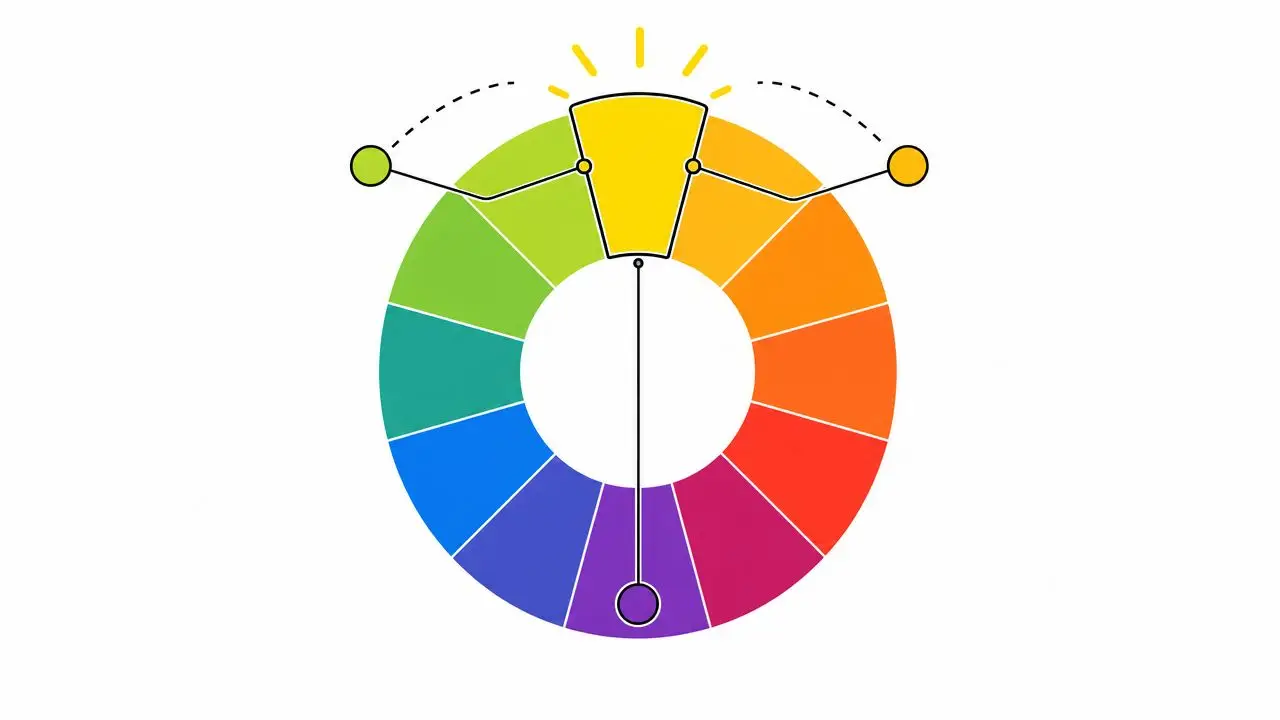
The three easiest groups to remember
Complementary colors sit opposite yellow. Blue is the classic example. This pairing creates a crisp, lively look because each color makes the other stand out more clearly.
Neighboring colors sit close to yellow. Green and orange usually feel smoother and more relaxed with it. These combinations tend to look natural and easy on the eyes.
Neutrals help manage yellow's brightness. White feels fresh. Gray feels modern. Black adds definition and drama.
A quick breakdown helps:
| Pairing type | Common colors with yellow | Effect in a room |
|---|---|---|
| Complementary | Blue, navy | High contrast, classic, energetic |
| Neighboring | Green, soft orange | Gentle, warm, layered |
| Neutral | White, gray, black | Balanced, flexible, easy to style |
Why some yellow pairings fail
Yellow can confuse people because it's bright even when it isn't loud. A pale yellow may still read lighter than expected. That's why yellow next to another light color can disappear instead of looking polished.
Practical rule: If yellow looks washed out, the problem usually isn't the yellow. The room often needs a darker partner nearby.
This is especially useful when selecting upholstery, rugs, and accent pieces. A homeowner might love yellow pillows on a cream sofa in the store, then get them home and feel underwhelmed. A navy throw, charcoal side table, or black-framed artwork often fixes that quickly.
For anyone building a room from the ground up, Guynn's expert guide to the perfect color palette offers a helpful starting point. Readers who are curious how darker accents can anchor a room may also enjoy this practical look at interior design advice for black, especially when yellow needs more definition.
Three Timeless Palettes Featuring Yellow
Some yellow combinations come and go. A few stay dependable because they solve real decorating problems. They balance brightness, add contrast, and make it easier to choose furniture, textiles, and finishes that feel connected.
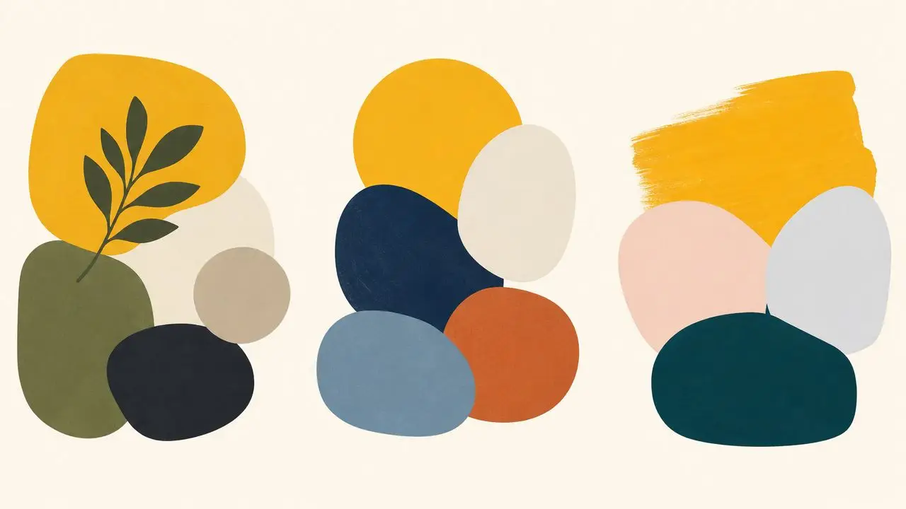
Yellow navy and white
This trio works because each color has a clear job. Yellow brings warmth. Navy adds depth. White keeps the room open and clean.
The pairing of blue and yellow has deep design roots. A strong modern example is the Ukrainian flag, whose blue and yellow bands are formally specified, with the blue identified as Pantone 2935 C and #0057B7, and the yellow as Pantone 012 C and #FFD700. The pairing is valued because blue and yellow are direct opposites in color space and are clearly distinguishable to most viewers, as explained in Nightingale's discussion of blue and yellow as complements.
In a home, that means navy can steady yellow without making the room feel heavy. White trim, bedding, or upholstery stops the contrast from becoming too intense.
This palette often fits:
- Traditional living rooms with navy seating and yellow patterned pillows
- Classic bedrooms with white bedding and a yellow bench or throw
- Dining spaces where navy drapery and yellow art add personality
Yellow charcoal and black
This combination feels sharper and more contemporary. Yellow acts as the bright note. Charcoal softens the transition. Black creates strong outlines.
It's a smart choice for homeowners who like modern furniture but don't want a room to feel cold. Charcoal has enough substance to support yellow, and black hardware, lamp bases, or frames make the whole palette look intentional.
A little yellow goes a long way in a dark palette. One chair, a pillow group, or a single piece of art can be enough.
This approach works well in bedrooms, home offices, and open-concept living areas where strong contrast helps define the space.
Yellow sage and cream
This is the calmest of the three. It feels settled, earthy, and easy to live with. Sage lowers the intensity of yellow, while cream keeps everything warm rather than stark.
This palette often suits homes with:
- Natural wood tones
- Layered textiles
- Traditional or cottage-inspired furniture
- A softer, less formal mood
A mellow mustard or golden yellow usually works better here than a bright lemon tone. The room ends up feeling relaxed instead of busy.
For readers who want to play with combinations before shopping, this tool can help generate unique color palettes. Guynn also shares ideas for color coordinated rooms and setting the mood, which can help narrow down whether a room needs more contrast, more warmth, or more softness.
Bringing Sunny Styles into Every Room
A good yellow palette becomes easier to trust when it's attached to an actual room. Once homeowners can see where the sofa goes, what the bedding looks like, and how the dining chairs fit in, yellow stops feeling abstract and starts feeling useful.
Living room warmth without overwhelm
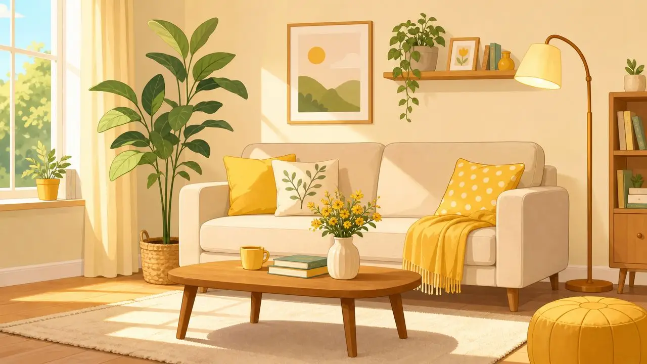
The living room is often the easiest place to try yellow because the color can stay movable. A gray sectional or neutral reclining sofa creates a calm base. Yellow comes in through pillows, a patterned rug, an ottoman, or a pair of accent chairs.
A La-Z-Boy seating piece in a neutral fabric works especially well for this kind of layering because the larger item stays versatile while the accents carry the color story. If the room already has brown wood tables or brass lighting, yellow usually looks even more natural.
A few combinations that feel dependable:
- Gray sofa plus mustard pillows for a soft modern look
- Navy chair plus yellow throw for more contrast
- Cream upholstery plus golden artwork for a lighter, traditional mood
Bedroom color that still feels restful
Yellow in a bedroom doesn't have to feel energetic. It can feel gentle, especially when paired with white, cream, wood, and a darker accent like navy or charcoal.
A wooden Bassett bedroom suite can pair nicely with buttery yellow walls or yellow accents in bedding and drapery. White linens keep the room crisp. A navy blanket at the foot of the bed gives the eye a place to land.
Mattress layers matter visually too. Sealy and Therapedic bedding basics in white or soft neutrals help yellow read as fresh rather than busy. In a bedroom, restraint often looks more luxurious than lots of pattern.
Bedrooms usually respond best to yellow when the color is softened by texture. Quilts, woven throws, and upholstered benches make the palette feel quieter.
Dining room cheer with structure
Dining areas can handle a little more color because they benefit from energy and personality. Yellow chairs, a painted buffet, or patterned seat cushions can lift a wood table without making the room feel formal.
Ashley dining pieces often suit this kind of mix because wood finishes and simple silhouettes leave room for color to do some work. A rustic table with yellow upholstered chairs can feel friendly and gathered. A darker table with cream walls and yellow artwork can feel more refined.
Entryways and smaller spaces
Small spaces are a smart place for yellow because the commitment is lower and the payoff is high. A bench, mirror, lamp, or runner can brighten an entry hall right away.
Guynn Furniture & Mattress offers furniture and décor options that make this kind of room-by-room approach possible, especially for households that want to tie together living, bedroom, and dining spaces without guessing at every piece. That's often helpful for homeowners in Galax, Independence, Hillsville, and nearby communities who want to see coordinated options in person rather than trying to imagine them from scattered swatches.
Expert Styling Tips for Using Yellow
Choosing colors that go with yellow is only part of the job. Placement, texture, and contrast matter just as much. Yellow can be beautiful and still feel awkward if it shows up in the wrong amount or in the wrong finish.
Keep yellow in the accent role first
For many rooms, yellow works best as an accent rather than the dominant color. In design systems and high-contrast visual work, yellow is often treated as a lightness-constrained accent because it can be hard to read or define against light backgrounds. Guidance also notes that yellow tends to work better with darker elements around it, and designers often shift it toward brown or gold for more usable contrast, as discussed in this article on the dark yellow problem in design system palettes.
That same idea applies at home. A yellow pillow on a white chair may need dark trim nearby. A yellow wall may need darker drapery, wood furniture, or black frames to feel finished.
Use proportion to stay balanced
The familiar 60-30-10 decorating guideline is helpful here as a styling habit, even when homeowners apply it loosely.
- The larger share usually belongs to a quiet neutral such as cream, gray, beige, or soft white.
- The middle layer can be a supporting color like navy, sage, charcoal, or muted blue.
- The smallest layer is where yellow shines through pillows, art, lamps, florals, or one upholstered piece.
That structure keeps yellow from spreading everywhere at once.
Change texture, not just color
One yellow fabric can feel playful. Several yellow textures can feel thoughtful. Velvet, linen, woven cotton, painted wood, ceramic, and brass all reflect yellow differently.
For creating balanced palettes, expert guidance recommends pairing yellow with cooler, darker companion colors such as blue, green, or purple, and varying lightness and saturation, not just hue, because yellow's natural brightness can overpower nearby colors if everything sits at the same visual level. That advice is explained in Datawrapper's piece on colors for data visualization style guides.
A room with a mustard pillow, a pale gold lamp base, and a deeper ochre throw often feels richer than a room filled with one flat yellow repeated over and over.
Add a natural element
Plants help yellow feel grounded, especially in living rooms and sunrooms. For homeowners who enjoy unusual greenery, this resource for cactus collectors offers inspiration for bringing color variation and texture into the room through plants as well.
Readers who are considering a stronger color moment on one wall may find Guynn's article on creating a perfectly balanced accent wall especially useful when yellow needs a little structure around it.
Start Your Sunny Makeover with Confidence
Yellow doesn't have to be a leap. In most homes, it works best as a thoughtful layer. A navy chair, a cream rug, a charcoal lamp, a sage throw, or a set of yellow pillows can change the mood of a room without making it feel overdone.
That's especially true when the room is built around comfort first. Families in Southwestern Virginia and Northern North Carolina often want spaces that are welcoming, durable, and easy to live in. Yellow can absolutely fit that goal. It adds warmth without asking a room to become flashy.

For homeowners who still feel unsure, seeing colors in person usually helps more than staring at paint chips or fabric swatches online. Guynn's guide to picking the perfect paint color for your home can also make the decision process feel more manageable.
Since 1902, Guynn has served Galax, Independence, Hillsville, and the wider region with a no-pressure atmosphere that makes it easier to compare styles, test comfort, and find a practical color plan. Shoppers can look at pieces from La-Z-Boy, Ashley, Bassett, Sealy, and Therapedic, ask for help from expert design staff, and choose from a large in-stock selection for immediate delivery. Free in-home delivery and setup within 60 miles removes a lot of the stress once the choice is made, and the Low Price Promise includes matching local competitors and a 30-day price guarantee.
A sunny room doesn't need perfection. It just needs a good starting point, a few dependable pairings, and the confidence to keep yellow in the right role for the space.
Visit Guynn Furniture & Mattress to explore room ideas in person in Galax, Independence, or Hillsville. Homeowners across Southwestern Virginia and Northern North Carolina can also schedule a consultation with the design team to plan a dream room with confidence, or browse the current selection online.